The York Water Company Case Study

The York Water Company
____________
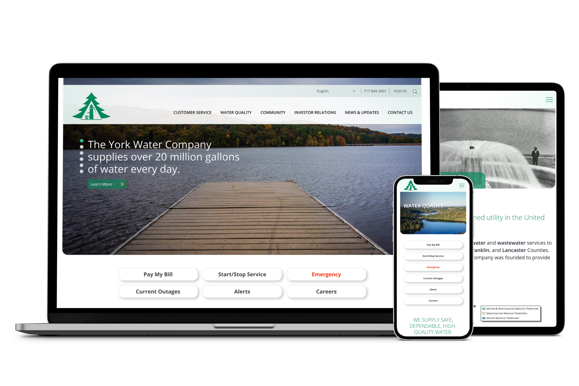
In 2023, we designed The York Water Company’s brand-new website. We created a modern and professional look for York Water and an exceptional user experience for site visitors, no matter their abilities, the language they speak, or the device they use.
Who is The York Water Company?
The York Water Company, incorporated in 1816, is the oldest investor-owned utility in the United States. It provides water and wastewater service to more than 210,000 Pennsylvanians in York, Adams, Franklin, and Lancaster counties.
York Water came to the Hayman Team to design a new website for the public utility. They wanted to focus on the user experience of their customers, investors, and community.
The Challenges
Multiple broad audiences
York Water’s audience is broad. It includes individuals across all age, income, education, language, and ability demographics. It also included several specific audiences:
- Customers
- Shareholders and potential investors
- Community members
- Regulators
- Job seekers
Mobile Access
Most of The York Water Company’s users access the website with a mobile device. Their old site was not mobile-friendly and frustrated users who were trying to access the site to pay their water or wastewater service bill. Our team needed to design a site that was device responsive from a wide screen monitor to a small smartphone.
Extensive Content
York Water’s original website included more than 150 pages of content that had been added over a number of years. Our team needed to design the aesthetic and organize content to help users quickly pay bills and efficiently find the information they needed whether it was how to read a water meter, what jobs are available, or where to find the company’s latest SEC filings.
Project Goals
These were the overall project goals:
- Create an easy to navigate, accessible, and sleek website.
- Make all content accessible.
- Improve the customer, community, and shareholder user experience.
- Reduce customer service inquiries.
- Create fresh, interesting content.
- Develop a backend that York Water staff could manage.
Our Solution
The experienced Hayman Team created a beautiful, accessible, user-friendly new site for The York Water Company.
User-Friendly Navigation
We crafted an easy-to-follow navigation structure and audience-specific user journeys to help users
- efficiently accomplish a task, like paying a bill or starting service,
- quickly find helpful information like what to do when a pipe is clogged,
- more deeply engage with content, like exploring company history and processes, and
- access important information like shareholder and corporate governance documents.
The design is sleek, bright, and brings modern professionalness to the York Water brand.
Accessible Content
York Water’s original website contained more than 150 pages of content, written over a number of years, and created by a number of individuals. With our process, we worked with the York Water team to refine, write, and distill content into 50 user and navigation-friendly pages. Our writing process focused on these goals:
- Create a consistent voice and style.
- Write for comprehension of customers and community.
- Meet or exceed the latest web accessibility standards.
- Write text that will be accurately translated by machine translation software.
- Write strategic content for customer education, company news and updates, career opportunities, and investment opportunities.
Reduce Customer Service Inquiries
One of the goals of the project was to reduce customer service phone inquiries. To help customers find answers to their questions without picking up the phone, we developed easy-to-find, helpful content and logical, easy-to-navigate pages. Some of that content includes the following:
- Search functionality
- Organized customer education
- FAQs
- Visual aids
Client Website Training
Upon completion of the website, we trained York Water staff to navigate the backend of the site and to make edits and additions to the site. We recorded the custom training so that York Water has a training tool for new staff who will be involved in keeping their web content up-to-date.
The Results
The results say it all! In the first two weeks of site launch, York Water saw a 27% increase in total site views. Pages that included specific content strategies, including the news, careers, investor relations, and lead information pages saw more than a 135% increase in views.
The York Water Company’s new website is easy to navigate, modern, and attractive. The backend of the site is designed with as much intention as the front. Staff are empowered to make changes and edits as they see fit. They can add blog posts, create new pages, and change content or images to keep the site fresh and exciting.
The Hayman Team is proud of the outcome for The York Water Company, and we are positive that their new site will keep its relevance for many years to come.
“Our experience has been extremely positive. The level of professionalism and obvious passion and skill for website content creation and design sets Hayman apart from others in their field. The support we have already received at this stage in the process has helped us feel confident in this tremendous undertaking for our company, which we do not take for granted.”
Molly Houck, Investor Relations and Communications Administrator at The York Water Company
WHAT WE DID
- Website design and development
- Custom WordPress backend development
- Audience analysis
- Website copywriting
- Location photography
- WordPress training
Leave a reply